Project Overview
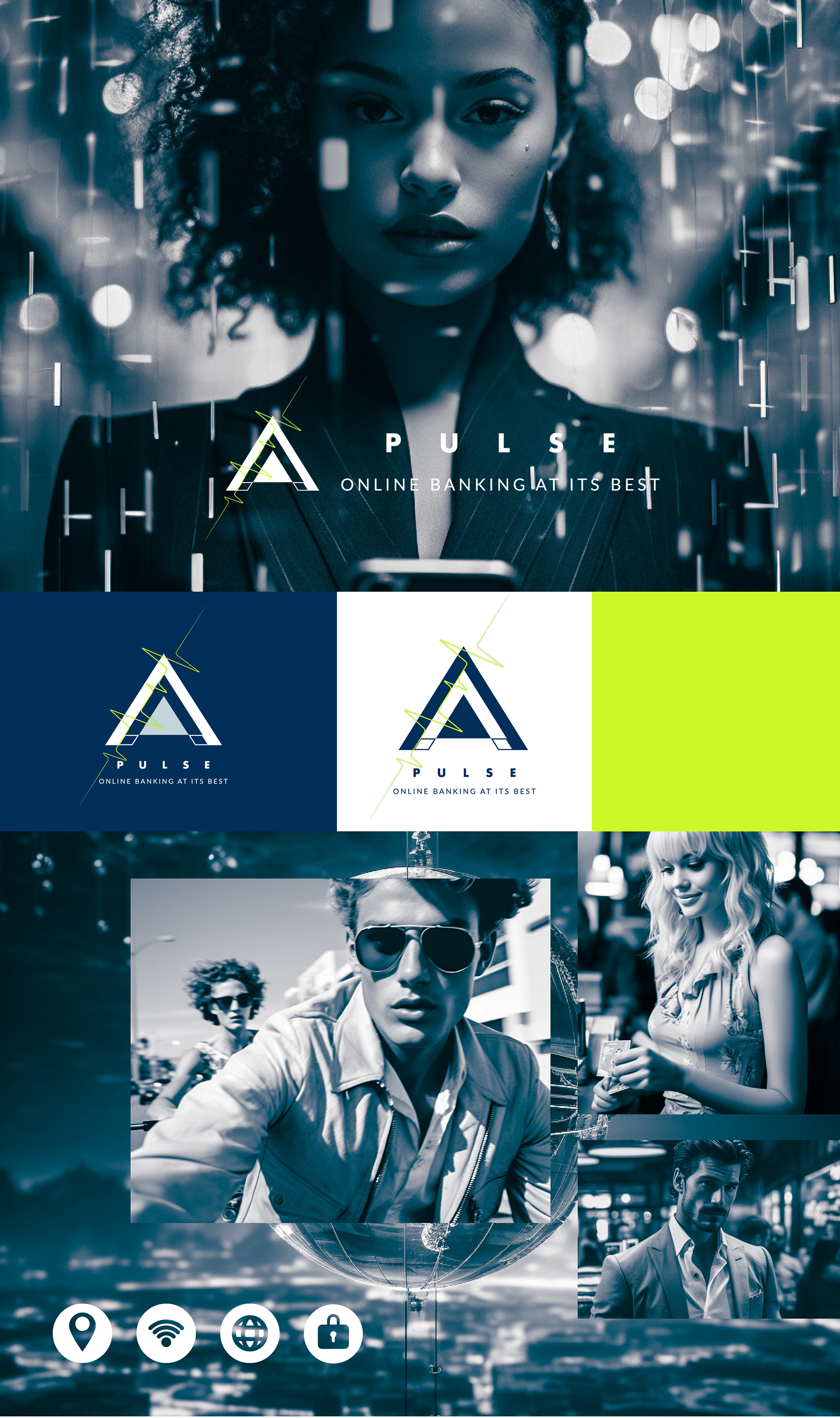
Pulse aims to establish a bold, refined, and innovative brand identity in the digital banking industry. Targeting tech-savvy young professionals and entrepreneurs, Pulse seeks to provide a seamless and secure digital banking experience.
Competitor Analysis
Pulse looks to distinguish itself from competitors Numulus, Fintech360, and Banky by focusing on a design aesthetic that is both advanced and accessible, Pulse will stand out from these competitors by blending technological innovation with ease-of-use and great design. Where Numulus is outdated, Fintech360 cold and techie, and Bankify targeted too narrowly, Pulse hits the sweet spot for our target demographic.
Brand Values
Innovation - Pulse constantly evolves to leverage the latest technology and features.
Security - User data and information are protected through advanced encryption and cybersecurity.
Transparency - Pulse operates openly, providing clear fees, rates, and policies.
Inclusivity - Pulse invites people of all backgrounds to experience digital banking.


Creative Direction
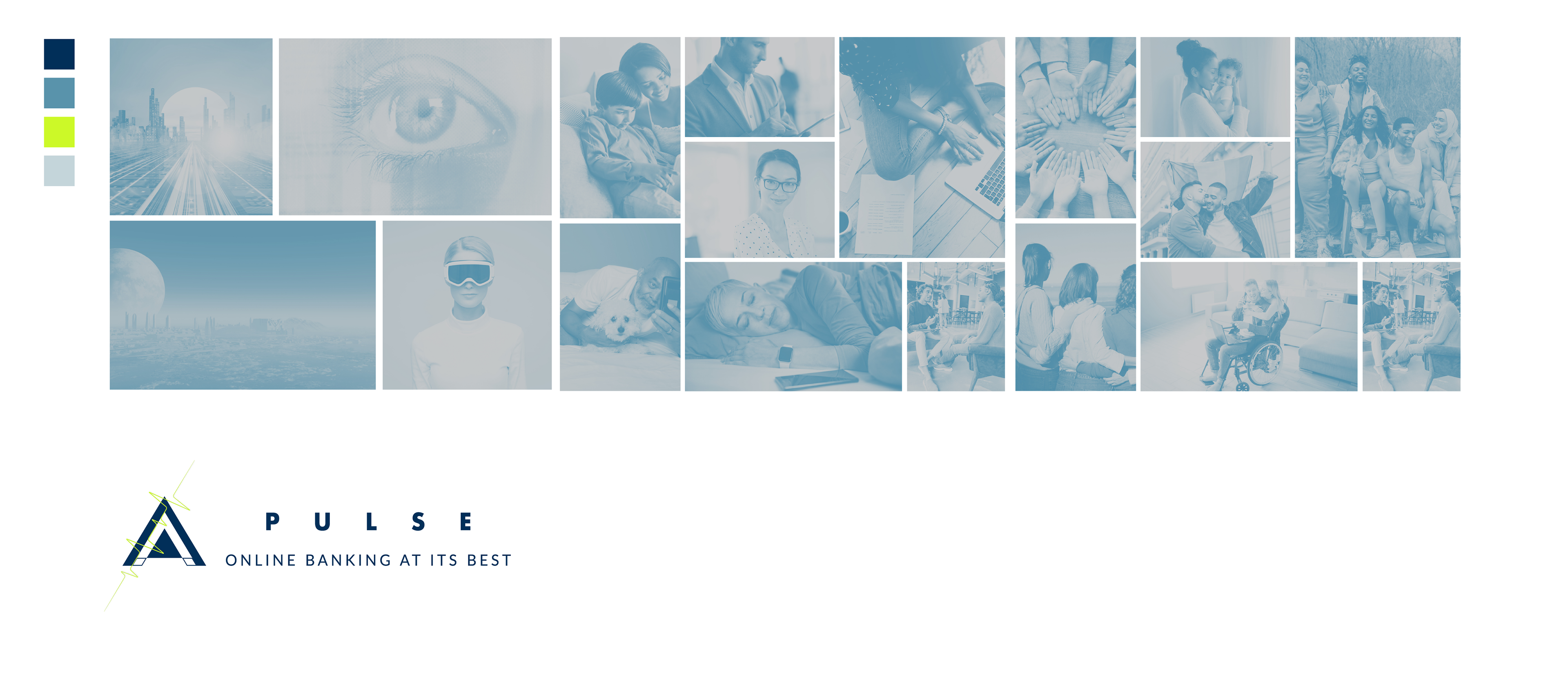
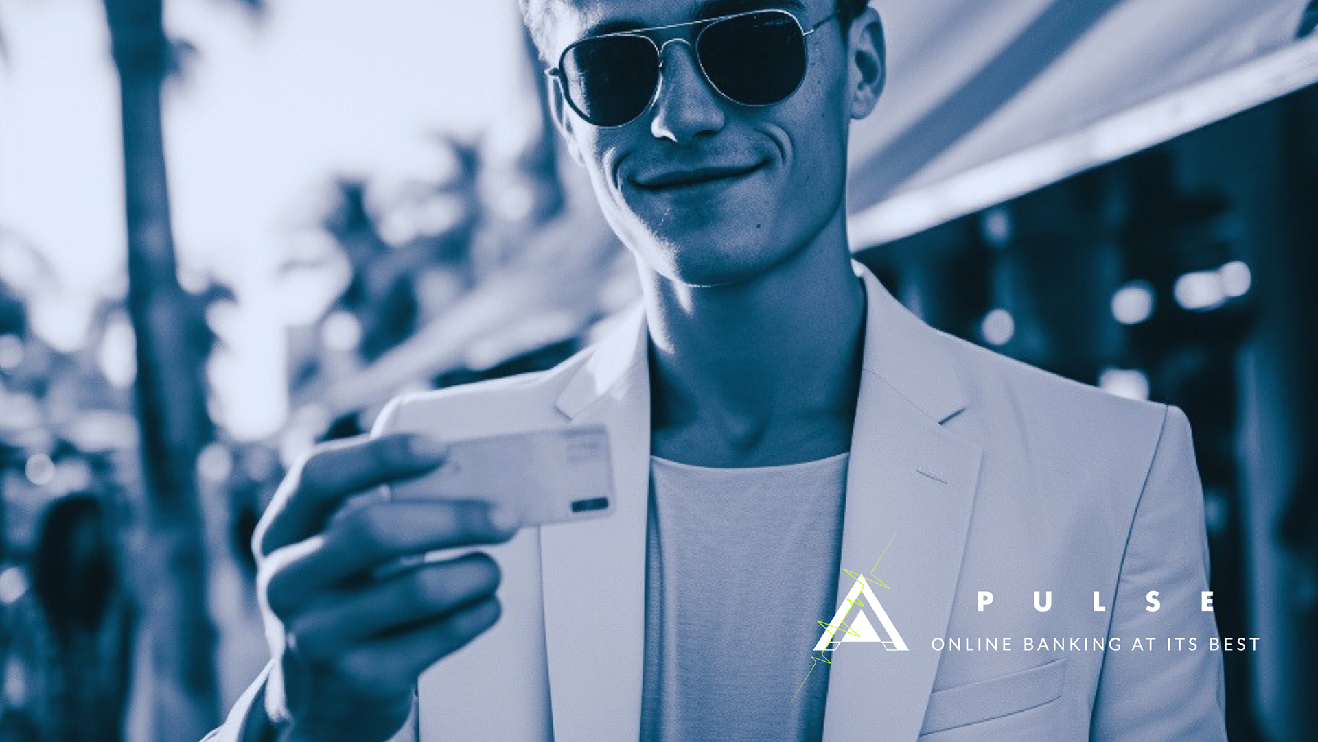
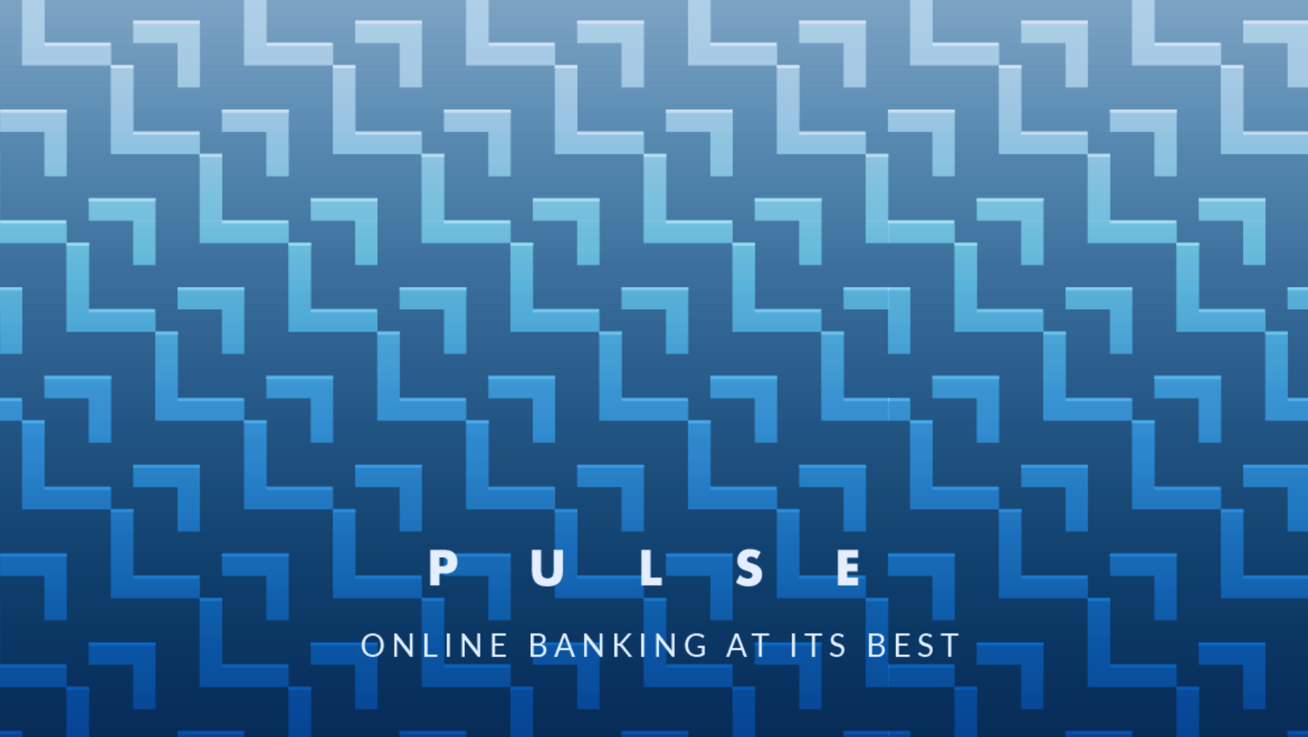
Imagery should evoke themes of trust, security, and embracing the future through technology and connected communities.
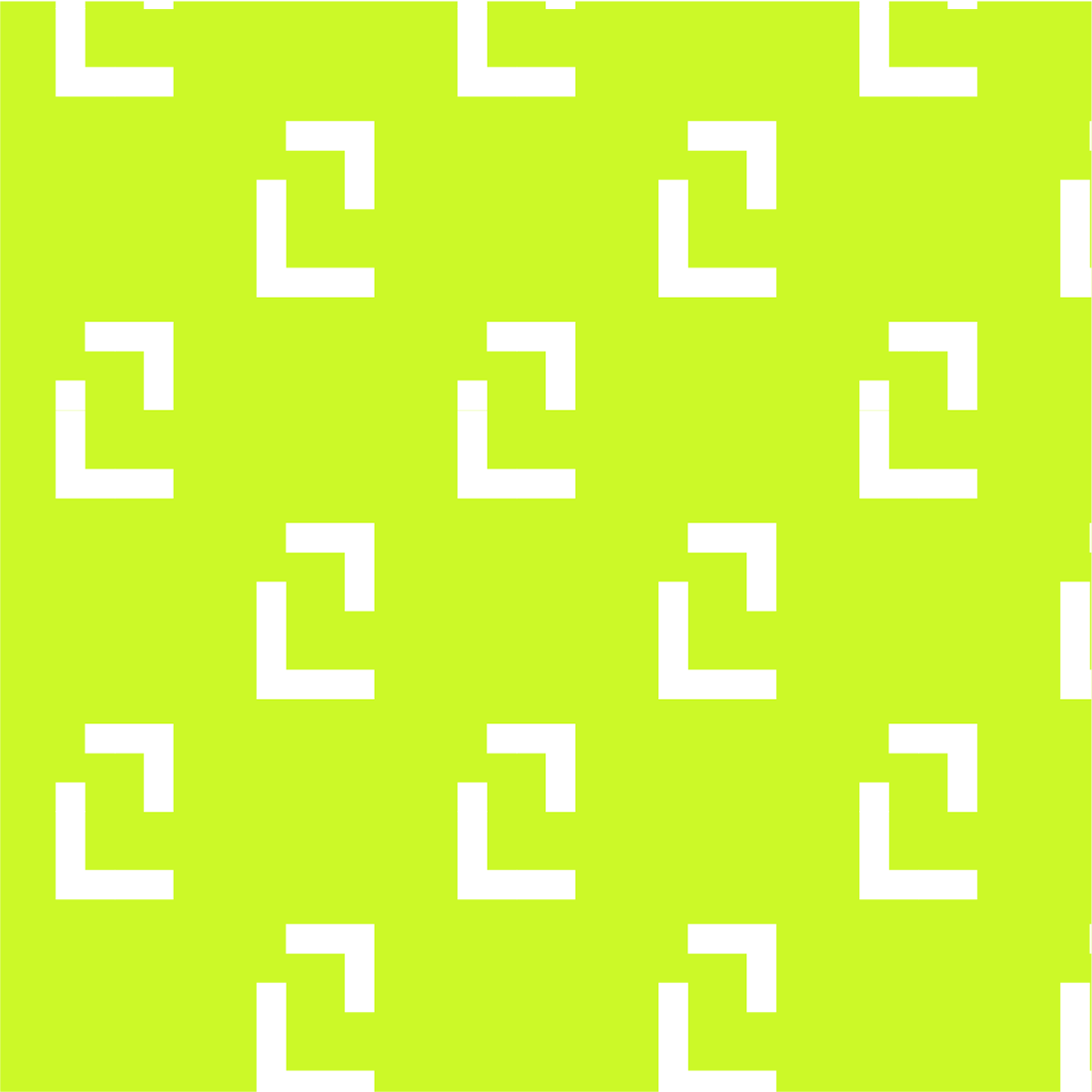
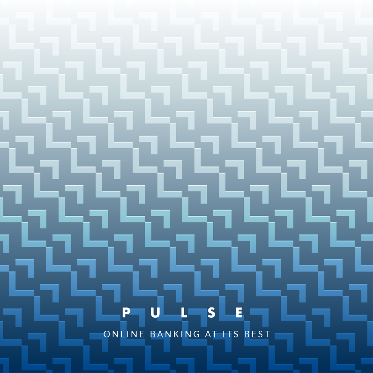
The inspiration for the visual identity stems from architectural elements that evoke strength, innovation and structure balanced with openness and transparency. Clean lines, geometric shapes and design motifs influenced by modern architecture establish an aesthetically advanced yet visually minimalist identity.
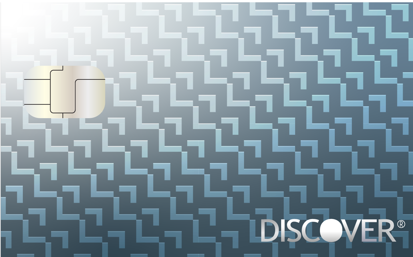
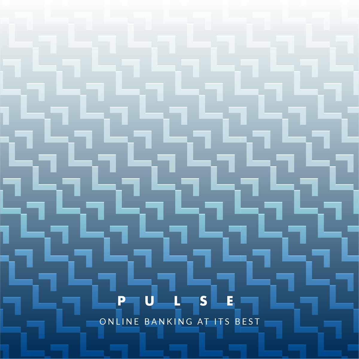
Color Palette: Cool-toned blues and greens create a modern, crisp aesthetic. Metallic accents add a grounded, established feel.
Typography: Sleek sans-serif fonts paired with serif fonts nod to banking tradition. A variety of weights create visual interest.
The primary typeface selected for Pulse is Futura - a sleek, sans-serif font that conveys modernity and forward-thinking. Futura's clean, efficient letterforms and excellent legibility align with Pulse's tech-focused aesthetic. It comes across as contemporary yet classic - perfect for a digital bank aiming to be an innovative leader in the industry.
To complement the Futura typeface, we've paired it with Lato Thin for accents and headlines. Lato Thin's delicate, hairline weight creates a light, airy feeling, allowing the bolder Futura to stand confidently on its own in body copy. This combination provides the appropriate amount of contrast - Lato Thin brings a sense of openness and accessibility, while Futura keeps the overall typographic palette clean and refined.
Together, this typographic system stays true to the sleek, modern, and confident visual identity Pulse wishes to convey. The Futura and Lato Thin pairing unites digital clarity with enough personality to connect with users seeking an intuitive, humanized banking experience.
Textures: Glass, steel, and technology patterns reference the digital focus. Clean, geometric shapes are prioritized over grunge.
Emotional Response: Instills confidence in users and an excitement about the possibilities of digital banking.

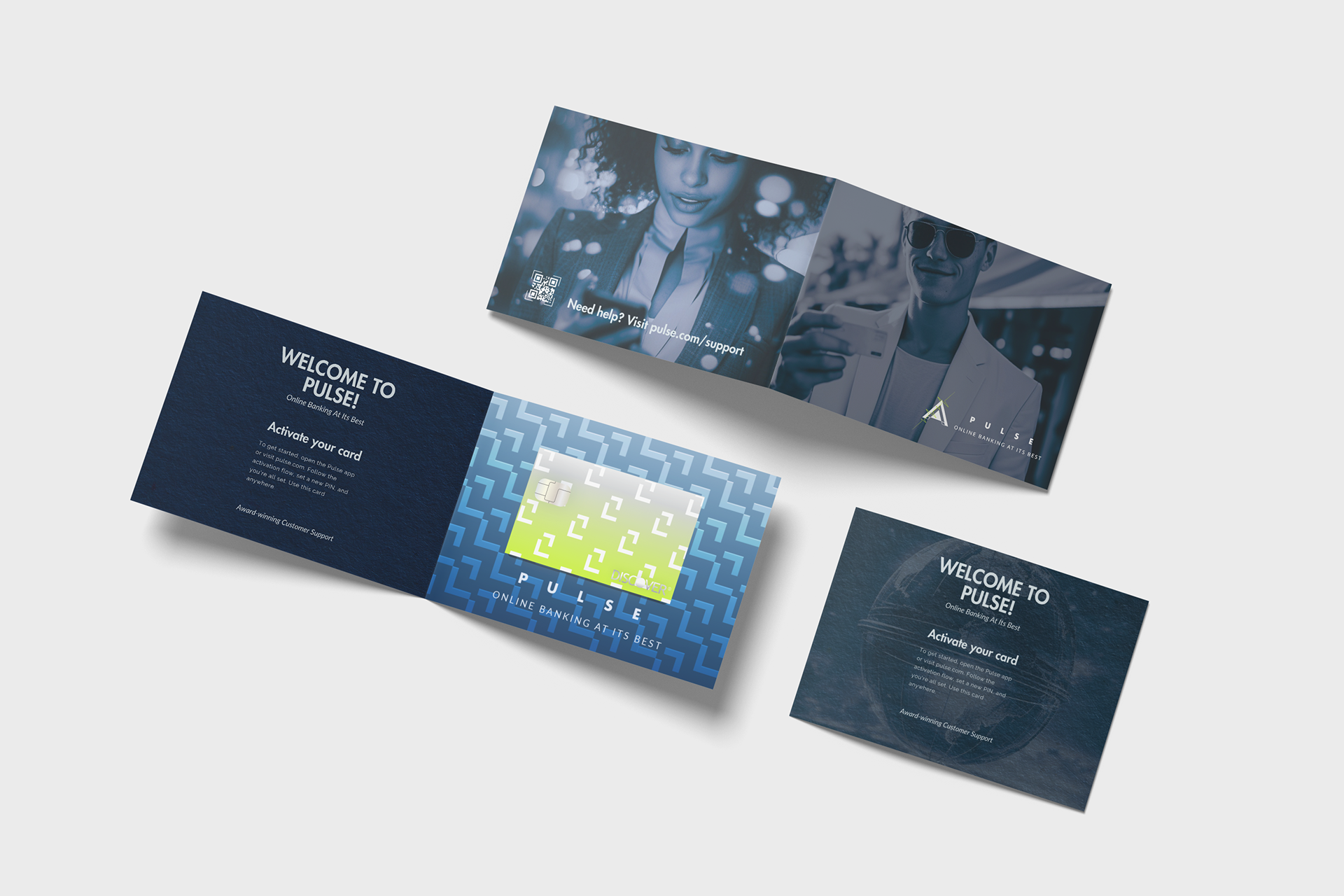
Credit Card Mailer
Credit Card Mailer Front Cover
Interior Page for Card Attachment

Back Image for Mailer
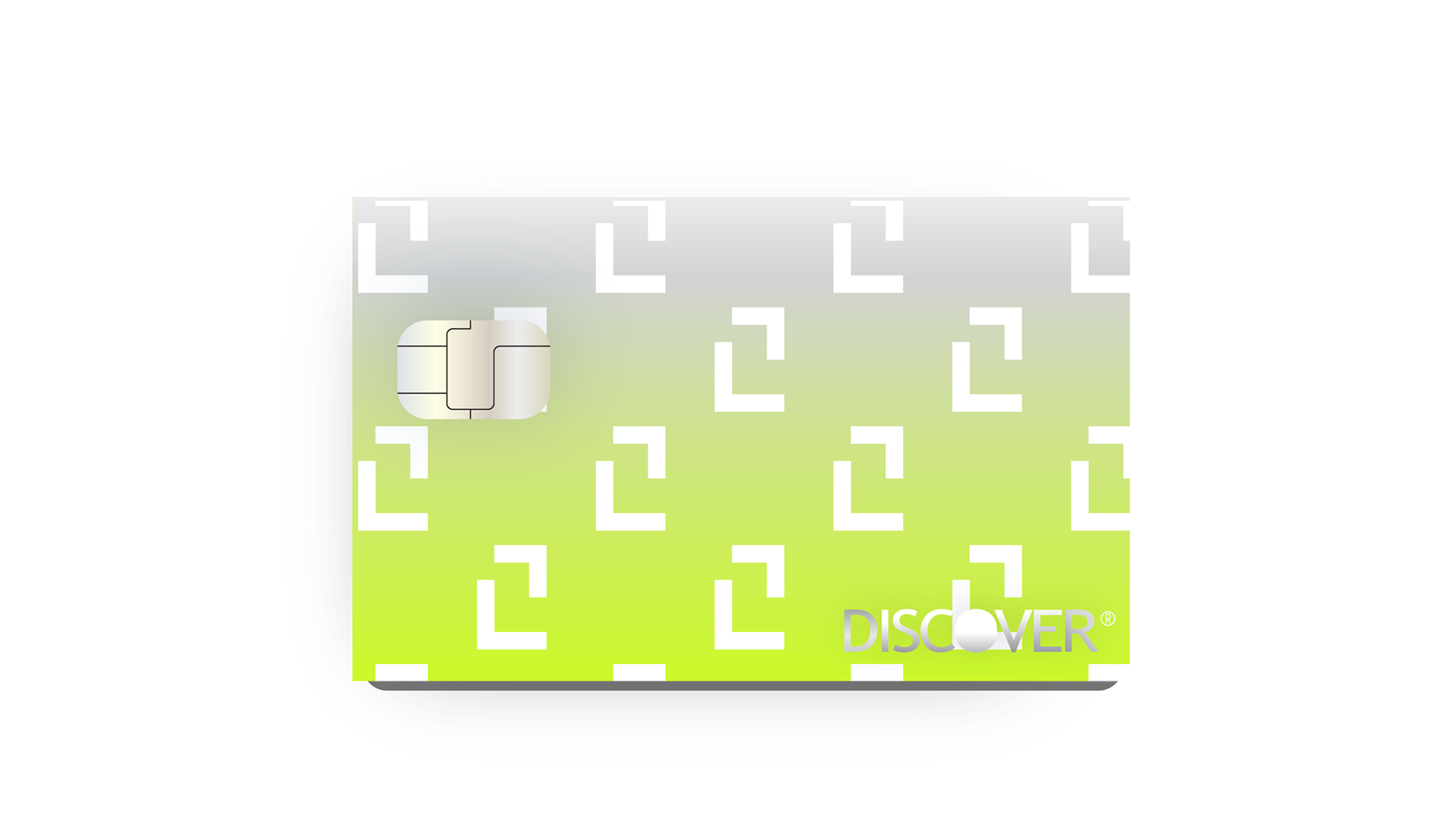
Card Design 01
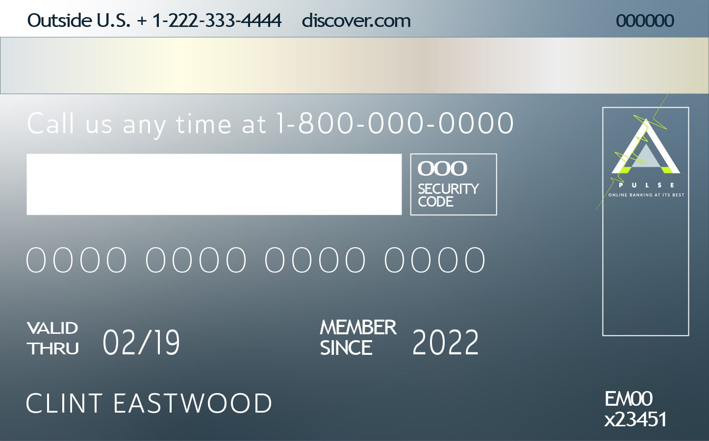
Card Back